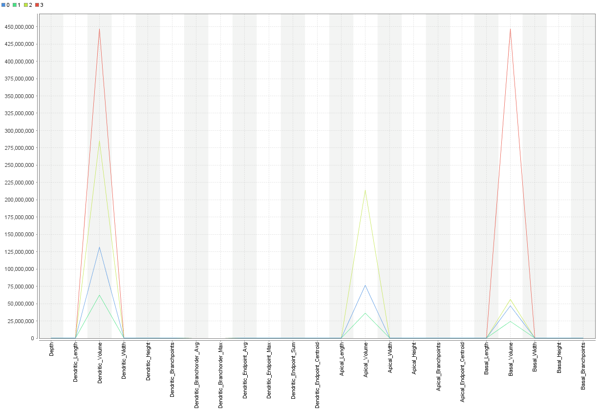
What does this cluster plot explain?
Hello, I am doing clustering using X-mean thhat yields into 4 cluster and in my results I have one centroid table and also a plot option which looks as in picture.
Can comeone kindly explain what does the plot is describing? I couldn't really figure it out by the first look! I guess it showed the features that have been used for clustering and their range...but it doesn't make sense with its shape so I donno
谢谢!
Best Answer
-
 IngoRM
Administrator, Moderator, Employee, RapidMiner Certified Analyst, RapidMiner Certified Expert, Community Manager, RMResearcher, Member, University ProfessorPosts:1,751
 RM Founder
Hi,
No. Each line in the plot shows the values of the centroid of your clusters. Think about how k-means (and other centroid-based clustering mechanisms) work. They determine the centroids for each of the k clusters and assign all data points to their nearest centroids. In this sense the centroids can be seen as prototypical for your clusters.
The plot now shows for all your columns (in a so-called "parallel plot") where those cluster centroids are located. This allows you to understand things like
- where do the clusters differ most (which attributes are important for which cluster)
- where do the clusters not differ (all clusters have basically the same values for certain attributes)
- how "complex" are the differences between the clusters, i.e. do you need a lot of attributes to differentiate the clusters or only a few
Hope this helps,
Ingo
2

 Contributor I

Answers
My initial review of the plot shows that your cluster model isn't that great. I think you're suffering from a scaling issue because all other attributes look very flat. Try rescaling all the values (maybe use a Normalize operator with z-transformation) .The only thing that jumps out at me is that Cluster 3's basal volume is very different from all the rest.
Yes that is true, I already am aware tha ty data need noralization but you could you please tell me what does this plot explain?? How can I interprete it? is it just saying that my clustering was done using only 3 three attributes? and is it showing only maximum attribute in each cluster or is it basd on the average ?
Thank you
To tack on here, if I have z-score normalized a value like "Duration" in my Example Set, and the centroid value gets calculated as "- 0.5" in Cluster 1, does this indicate that centroid value for Duration in Cluster 1 is 0.5 of a standard score to the left (or less than the mean)?